Time Series Analysis with STUMPY
Analysis of Time Series Data using Matrix Profiles with SUMPY
Notes on Modern Time Series Analysis with STUMPY || Sean Law and STUMPY Docs
Overview
When the number of datapoints we're analyzing becomes large it can become very difficult to analyze data and find trends, identify seasonality, or find outliers
Things we can normally do with time series data
- Visualize
- Statistical Analysis
- ARIMA
- Anomaly Detection
- Forecasting
- Machine Learning
- Clustering
- Dynamic Time Warping
- Deep Learning
There's generally no solution that will work for everything. Each method comes with some comprimise
The Goal
"If a behaviour is conserved, there must have been a reason why it was conserved and teasing out the reasons/causes is often very useful"
When considering the above, we can ask the two following questions:
- Do any conserved behaviours exist in my data?
- If there are conserved behaviours, what are they and where are they?
A subsequence is a part of the full sequence over time
The Solution
We want our solution to be:
- Easy to interpret
- User/Data agnostic
- No Prior Knowledge - don't need training
- Parameter free or have intuitive parameters
Distance Matrices
Comparison between sequences can be done by looking at the euclidean distance between all the points in two subsequences:

Using this idea, can we ask the question: is this sequence repeated?
We can calculate this by sliding a window over different parts of our data and calculating the distance between these subsequences:
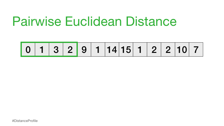
The result of the above is called a distance profile, in order to check if the sequence is preserved we look for the next closest match. We can do this by computing a distance matrix which shows us the sequence combinations that are repeated through the data:
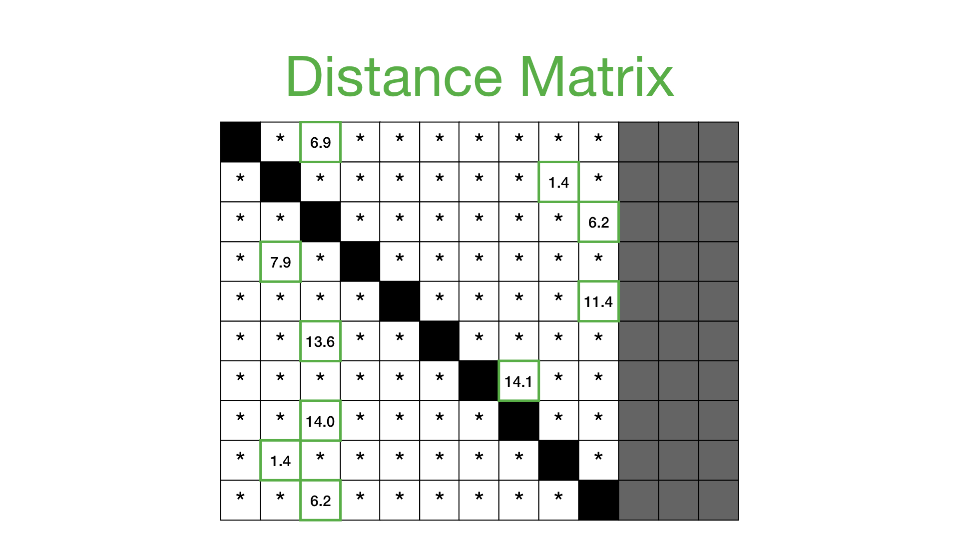
The above solution, however, is not very scalable since it's got a high computational time and space using a brute force method in order to calculate the distance matrix
Matrix Profile
In order to get around the time/space problem when calculating the distance matrix we have the idea of a Matrix Profile
"A Matrix Profile is a vector that stores the distance (normalized, z-index, euclidean) between each subsequence within a time series and its nearest neighbor"

This is basically the closest distances only stored and can be used to annotate the tim series that we have
We can find conserved subsequences by looking at the minumum of the matrix profile, for example:

The consered subsequence is known as a Motif
Matrix Profile Index
"A Matrix Profile Index is the index (location) of the nearest neighbor for a given subsequence"
The matrix profile index tells us where is the nearest location of a subsequence:

A potential discord/anomaly can be found by looking at the largest value in the matrix profile:

Since this segment is most different to all other datapoints in the sequence
Algorithms for Calculating Matrix Profiles
| Algorithm | Type | Time Complexity | Space Complexity |
|---|---|---|---|
| Brute Force | Naive | ||
| STAMP | FFT | ||
| STOMP | Algebra | ||
| GPU-STOMP | Hardware |
STUMPY
STUMPY is a python library implementation of STOMP and has support for:
- STUMP - implementation of STUMP
- GYP-STUMP - STUMP with GPU
- MSTUMP - multi-data STUMP
- SCRUMP - approximate matrix profiles
- STUMPI - STUMP for streaming data
STUMPY is designed to be used along with the above mentioned methods and can be used for doing time base analysis
import numpy as np
import pandas as pd
import seaborn as sns
import matplotlib.pyplot as plt
from matplotlib.patches import Rectangle

import stumpy
steam_df = pd.read_csv("https://zenodo.org/record/4273921/files/STUMPY_Basics_steamgen.csv?download=1")
steam_df.head()
| drum pressure | excess oxygen | water level | steam flow | |
|---|---|---|---|---|
| 0 | 320.08239 | 2.506774 | 0.032701 | 9.302970 |
| 1 | 321.71099 | 2.545908 | 0.284799 | 9.662621 |
| 2 | 320.91331 | 2.360562 | 0.203652 | 10.990955 |
| 3 | 325.00252 | 0.027054 | 0.326187 | 12.430107 |
| 4 | 326.65276 | 0.285649 | 0.753776 | 13.681666 |
y = steam_df['steam flow']
x = steam_df.index
m = 640
matrix_profile = stumpy.stump(y, m)
matrix_profile
array([[16.235411477247848, 2242, -1, 2242],
,       [16.08191866323064, 2243, -1, 2243],
,       [15.909403017873458, 2245, -1, 2245],
,       ...,
,       [9.022931372214867, 877, 877, -1],
,       [9.0382596759492, 878, 878, -1],
,       [9.054692514421166, 879, 879, -1]], dtype=object)
matrix_profile_df = pd.DataFrame(matrix_profile, columns=['profile', 'profile index', 'left profile index', 'right profile index'])

matrix_profile_df.tail(10)
| profile | profile index | left profile index | right profile index | |
|---|---|---|---|---|
| 8951 | 8.937284 | 871 | 871 | -1 |
| 8952 | 8.949783 | 872 | 872 | -1 |
| 8953 | 8.96176 | 873 | 873 | -1 |
| 8954 | 8.974059 | 873 | 873 | -1 |
| 8955 | 8.986255 | 874 | 874 | -1 |
| 8956 | 8.997375 | 875 | 875 | -1 |
| 8957 | 9.009344 | 876 | 876 | -1 |
| 8958 | 9.022931 | 877 | 877 | -1 |
| 8959 | 9.03826 | 878 | 878 | -1 |
| 8960 | 9.054693 | 879 | 879 | -1 |
Find the Best Motif
The best motif is the one where the profile is the smallest (since the profile is the distance value)
Checking for the minimum will give us two matches, each of these should refer to each other which can be seen by looking at the profile index:
best_motif = matrix_profile_df[matrix_profile_df['profile'] == matrix_profile_df['profile'].min()]
best_motif
| profile | profile index | left profile index | right profile index | |
|---|---|---|---|---|
| 643 | 5.49162 | 8724 | 296 | 8724 |
| 8724 | 5.49162 | 643 | 643 | 8960 |
We can plot this motif below:
profile_df = matrix_profile_df[['profile']]

fig, ax = plt.subplots(2, figsize=(16,8), sharex=True)
g1 = sns.lineplot(y=y, x=x, ax=ax[0])
g2 = sns.lineplot(data=profile_df, ax=ax[1])

for idx in best_motif.index.to_list():
    g1.axvline(x=idx, color="green")
    g2.axvline(x=idx, color="green")
    rect = Rectangle((idx, 0), m, 40, facecolor="lightgrey")
    g1.add_patch(rect)
<Figure size 1152x576 with 2 Axes>

We can also view the above zoomed in:
fig, ax = plt.subplots(figsize=(16,4))

for idx in best_motif.index.to_list():
    plot_y = y.iloc[idx:(idx+m)].to_list()
    sns.lineplot(data=plot_y, ax=ax)
<Figure size 1152x288 with 1 Axes>

Comparatively, we can compare two random subsequences which don't have any specific relation
fig, ax = plt.subplots(figsize=(16,4))

for idx in [0, 1000]:
    plot_y = y.iloc[idx:(idx+m)].to_list()
    sns.lineplot(data=plot_y, ax=ax)
<Figure size 1152x288 with 1 Axes>

Find a Discord
Potential discords/anomalies can be located as data that's most different to any existing datapoints, this can be found by finding the max profile distance. We can find the anomaly segment by getting this value and plotting it below:
discord = matrix_profile_df[matrix_profile_df['profile'] == matrix_profile_df['profile'].max()]
discord
| profile | profile index | left profile index | right profile index | |
|---|---|---|---|---|
| 3864 | 23.476168 | 4755 | 1864 | 4755 |
fig, ax = plt.subplots(2, figsize=(16,8), sharex=True)
g1 = sns.lineplot(y=y, x=x, ax=ax[0])
g2 = sns.lineplot(data=profile_df, ax=ax[1])


rect = Rectangle((discord.index[0], 0), m, 40, facecolor="lightgrey")
g1.add_patch(rect)
g2.axvline(x=[discord.index[0]], color='C1')
<matplotlib.lines.Line2D at 0x7f88e0582fd0>
<Figure size 1152x576 with 2 Axes>

Time Series Chains
Time series chains are like motifs that evolve and drift over time
A Time series chain can be visualized as a set of motifs that have a close match in some direction, for example the red/green arrows below:

Time Series Chain Data
An example dataset for time series chains is the "Kohl" search volume on google
df_search = pd.read_csv("https://zenodo.org/record/4276348/files/Time_Series_Chains_Kohls_data.csv?download=1")

fig, ax = plt.subplots(figsize=(16,8))
sns.lineplot(data=df_search, ax=ax)
<AxesSubplot:>
<Figure size 1152x576 with 1 Axes>

Calculate the Matrix Profile
Calculating the matrix profile can be done as normal:
m = 20
mp_search = stumpy.stump(df_search['volume'], m=m)

mp_search_df = pd.DataFrame(mp_search, columns=['profile', 'profile index', 'left profile index', 'right profile index'])
mp_search_df.head()
| profile | profile index | left profile index | right profile index | |
|---|---|---|---|---|
| 0 | 3.329265 | 490 | -1 | 490 |
| 1 | 3.079098 | 209 | -1 | 209 |
| 2 | 2.904647 | 210 | -1 | 210 |
| 3 | 2.640721 | 211 | -1 | 211 |
| 4 | 2.898221 | 212 | -1 | 212 |
fig, ax = plt.subplots(2, figsize=(16,8), sharex=True)

sns.lineplot(data=df_search['volume'], ax=ax[0])
sns.lineplot(data=mp_search_df[['profile']], ax=ax[1])
<AxesSubplot:>
<Figure size 1152x576 with 2 Axes>

In the above we can see the growing pattern but we can also see sections where the matrix profile is small which means there is minimal difference between subsequences
Calculate Chains
We can calculate the chains in the dataset by using the allc function which also returns the unanchored chain (longest chain) which takes the left profile index and the right profile index:
all_chain_set, unanchored_chain = stumpy.allc(mp_search[:, 2], mp_search[:, 3])

unanchored_chain
array([ 35, 87, 139, 244, 296, 400, 452])
fig, ax = plt.subplots(figsize=(16,8), sharex=True)

sns.lineplot(data=df_search)

for idx in unanchored_chain:
    rect = Rectangle((idx, 0), m, 1, facecolor="lightgreen")
    ax.add_patch(rect)
<Figure size 1152x576 with 1 Axes>

From the above we can identify which segments were identified as being part of the chain, we can also see that some points are missed - this could be due to undersampling of the data or that the datapoints are less similar than other comparative datapoints
Semantic Segmentation
An analysiss we can we can perform on increasing data quantities is segmentation. Can we take a long series of data and chop it into k regions where k is small wuth the goal of passigng it on to a human or machine annotator
FLUSS can be used to do this kind of analysis, for our sake let's take the above data and select the timeframe of a single bump:
In order to calculate the regimes we need to get the matrix profile of the input data:
Note that the segments account for segmentation between regimes - i.e. there is a split in the relationship of the data on each side of the input data - the two parts have their own profile relations
Calculatting the regimes depends on the profile index and not necessarily the profile value itself
We can try to ssegment the data into 3 regimes using the below
L = m
regimes = 3
cac, regime_locations = stumpy.fluss(mp_search[:, 1], L=L, n_regimes=regimes, excl_factor=1)
Note that we only have 2 locations as a result, this is because the regime_locations indicate the regime changeover points - the ranges can be inferred from these
regime_locations
array([159, 247])
fig, ax = plt.subplots(3, figsize=(16,8), sharex=True)

sns.lineplot(data=df_search, ax=ax[0])
sns.lineplot(data=mp_search_df['profile'], ax=ax[1])
sns.lineplot(data=cac, ax=ax[2])

for idx in regime_locations:
    for adx in ax:
        adx.axvline(x=idx, color='C1')
<Figure size 1152x576 with 3 Axes>

The basic process for segmentation is the same for any given number of segments and the code above is generic with regards to that
Fast Pattern Matching
We can use STUMPY to find predefined patterns in data, this can also be much more efficient than trying to find general patterns in a dataset
This can be visualized by trying to query for patterns in the Sony AIBO Robot Dog Dataset:
search_df = pd.read_csv("https://zenodo.org/record/4276393/files/Fast_Pattern_Searching_robot_dog.csv?download=1")
search_df.head()
| Acceleration | |
|---|---|
| 0 | 0.89969 |
| 1 | 0.89969 |
| 2 | 0.89969 |
| 3 | 0.89969 |
| 4 | 0.89969 |
We can plot the data below, showing the carpet section with the grey background
fig, ax = plt.subplots(figsize=(16,8))


# carpet section
rect = Rectangle((5000, -4), 3000, 10, facecolor="lightgrey")
ax.add_patch(rect)

sns.lineplot(data=search_df, ax=ax)
<AxesSubplot:>
<Figure size 1152x576 with 1 Axes>

We can use the query data which is a segment that identifies data from when the robot was om the carpet:
query_df = pd.read_csv("https://zenodo.org/record/4276880/files/carpet_query.csv?download=1")
query_df.head()
| Acceleration | |
|---|---|
| 0 | 0.111111 |
| 1 | 0.111111 |
| 2 | 0.128205 |
| 3 | 0.111111 |
| 4 | 0.111111 |
It's also relevant to note that the data in the query is not scaled the same as the data in the search sequence, this will be handles appropriately be stumpy which will do a z-normalization when calculating distances
fig, ax = plt.subplots(figsize=(16,8))

sns.lineplot(data=query_df, ax=ax)
<AxesSubplot:>
<Figure size 1152x576 with 1 Axes>

The stumpy.mass function will look for this segment in the given data:
distance_profile = stumpy.mass(query_df['Acceleration'], search_df['Acceleration'])
distance_profile_df = pd.DataFrame(distance_profile)

distance_profile_df.head()
| 0 | |
|---|---|
| 0 | 15.617256 |
| 1 | 15.400917 |
| 2 | 15.146692 |
| 3 | 14.894353 |
| 4 | 14.690273 |
We can sort the distance profiles to find the index with the best fit:
distance_profile_df_sorted = distance_profile_df.sort_values(0)
distance_profile_df_sorted.head()
| 0 | |
|---|---|
| 7479 | 3.954503 |
| 6999 | 4.103417 |
| 7719 | 4.331618 |
| 7478 | 4.391748 |
| 7559 | 4.462875 |
We can then plot the nearest few matches along with the original data:
fig, ax = plt.subplots(figsize=(16, 8))

# carpet section
rect = Rectangle((5000, -4), 3000, 10, facecolor="lightgrey")
ax.add_patch(rect)

sns.lineplot(data=search_df, ax=ax)

compare_len, _ = query_df.shape
for idx in range(50):
    index = distance_profile_df_sorted.index[idx]
    match_data = search_df.iloc[index:index+compare_len]
    ax.plot(match_data)
<Figure size 1152x576 with 1 Axes>

We can also take a zoomed in view of the above plot just into the carped segment:
fig, ax = plt.subplots(figsize=(16,8))
ax.set_xlim([5000, 8000])

sns.lineplot(data=search_df, ax=ax)

compare_len, _ = query_df.shape
for idx in range(50):
    index = distance_profile_df_sorted.index[idx]
    match_data = search_df.iloc[index:index+compare_len]
    ax.plot(match_data)
<Figure size 1152x576 with 1 Axes>

STUMPY also has a match function that can be used to do the sorting and index matching for us:
matches = stumpy.match(query_df["Acceleration"], search_df["Acceleration"])
matches_df = pd.DataFrame(matches, columns=["distance profile", "index"])

matches_df.head()
| distance profile | index | |
|---|---|---|
| 0 | 3.954503 | 7479 |
| 1 | 4.103417 | 6999 |
| 2 | 4.331618 | 7719 |
| 3 | 4.462875 | 7559 |
| 4 | 4.545081 | 7799 |
We can see that the above dataframe matches what we computed above
All matching segments can be plotted from the above list and we can build an understanding for how they compare:
Note that STUMPY makes use of z-normalized euclidean distances when comparing data, so we would want to normalize subsequences when plotting for comparison
We can see the normalized sequences that match below, with the white line being the query sequence
query_df_norm = stumpy.core.z_norm(query_df.values)

fig, ax = plt.subplots(figsize=(16,8))

compare_len, _ = query_df.shape
for _, idx in matches:
    match_data = search_df.iloc[idx:idx+compare_len].values
    ax.plot(match_data)

sns.lineplot(data=query_df_norm, ax=ax, lw=4, palette=['black'])
<AxesSubplot:>
<Figure size 1152x576 with 1 Axes>

We can also provide a maximum matching distance that we care about for similarity in order to get matches within a specific range. The default value for this is specified as two standard deviations from the mean: max_distance = max(np.mean(D) - 2 * np.std(D), np.min(D)), but we can change this:
matches_max_dist = stumpy.match(
    query_df["Acceleration"],
    search_df["Acceleration"],
    max_distance=lambda D: max(np.mean(D) - 4 * np.std(D), np.min(D))
)

query_df_norm = stumpy.core.z_norm(query_df.values)

fig, ax = plt.subplots(figsize=(16,8))

compare_len, _ = query_df.shape
for _, idx in matches_max_dist:
    match_data = search_df.iloc[idx:idx+compare_len].values
    ax.plot(match_data)

sns.lineplot(data=query_df_norm, ax=ax, lw=4, palette=['black'])
<AxesSubplot:>
<Figure size 1152x576 with 1 Axes>

Or more simply, we can just define the number of matches with max_matches:
matches_max_lim = stumpy.match(
    query_df["Acceleration"],
    search_df["Acceleration"],
    max_matches=10
)

query_df_norm = stumpy.core.z_norm(query_df.values)

fig, ax = plt.subplots(figsize=(16,8))

compare_len, _ = query_df.shape
for _, idx in matches_max_lim:
    match_data = search_df.iloc[idx:idx+compare_len].values
    ax.plot(match_data)

sns.lineplot(data=query_df_norm, ax=ax, lw=4, palette=['black'])
<AxesSubplot:>
<Figure size 1152x576 with 1 Axes>

Finding Conserved Patterns Across Two Time Series (AB-Join)
The stump method can find matching sequences in a single series as we have done before, but it can also be used to find motifs between two sequences of audio frequency data:
The matrix profile for these two sequences is done using an AB-Join
df_a = pd.read_csv("https://zenodo.org/record/4294912/files/queen.csv?download=1")
df_b = pd.read_csv("https://zenodo.org/record/4294912/files/vanilla_ice.csv?download=1")
df_a.head()
| under_pressure | |
|---|---|
| 0 | 0.0 |
| 1 | 0.0 |
| 2 | 0.0 |
| 3 | 0.0 |
| 4 | 0.0 |
df_b.head()
| ice_ice_baby | |
|---|---|
| 0 | -10.992350 |
| 1 | -11.066199 |
| 2 | -11.019284 |
| 3 | -9.691009 |
| 4 | -10.698435 |
Below is the method for identifying common motifs between the two datasets:
m = 500
mp_a = stumpy.stump(
    T_A=df_a['under_pressure'],
    T_B=df_b['ice_ice_baby'],
    m=m,
    # we want trivial matches since the sequences being compared are different
    ignore_trivial=False
)
We can compare the results of the profile below:
fig, ax = plt.subplots(3, figsize=(16,12), sharex=True)

sns.lineplot(data=df_a['under_pressure'], ax=ax[0])
sns.lineplot(data=df_b['ice_ice_baby'], ax=ax[1])
sns.lineplot(data=mp_a[:, 0], label="distance profile", ax=ax[2])
<AxesSubplot:>
<Figure size 1152x864 with 3 Axes>

In the above plot we can see two minimum values, along with their timestamps:
mp_a_df = pd.DataFrame(
    mp_a,
    columns=['distance profile', 'compared index', 'left index', 'right index']
).sort_values('distance profile')

mp_a_df['local index'] = mp_a_df.index

mp_a_df.head()
| distance profile | compared index | left index | right index | local index | |
|---|---|---|---|---|---|
| 904 | 14.135457 | 288 | -1 | -1 | 904 |
| 905 | 14.145091 | 289 | -1 | -1 | 905 |
| 906 | 14.162795 | 290 | -1 | -1 | 906 |
| 907 | 14.180128 | 291 | -1 | -1 | 907 |
| 903 | 14.190447 | 287 | -1 | -1 | 903 |
mp_a_min = mp_a_df.iloc[0]
mp_a_min
distance profile    14.135457
,compared index            288
,left index                 -1
,right index                -1
,local index               904
,Name: 904, dtype: object
Once we have the above location, we can plot the two segments comparatively:
index_a = mp_a_min['local index']
index_b = mp_a_min['compared index']

fig, ax = plt.subplots(figsize=(16,8))

sns.lineplot(data=df_a.iloc[index_a:index_a+m].values, ax=ax)
sns.lineplot(data=df_b.iloc[index_b:index_b+m].values, ax=ax, palette=['C1'])
<AxesSubplot:>
<Figure size 1152x576 with 1 Axes>

Consensus Motifs
Consensus motifs are patterns that are conserved across all time series within a set
The Ostinato algorithm is an efficient way of finding consensus motifs:
import stumpy
import matplotlib.pyplot as plt
import numpy as np
import pandas as pd
from matplotlib.patches import Rectangle
from scipy.cluster.hierarchy import linkage, dendrogram
We can use the mtDNA sequnce dataset to cluster different series by comparing them to each other. To do this we first need to read the data for each of the animals:
animals = ['python', 'red_flying_fox', 'hippo', 'alpaca']
dna_seqs = {}
truncate = 15000
for animal in animals:
    dna_seqs[animal] = pd.read_csv(
        f"https://zenodo.org/record/4289120/files/{animal}.csv?download=1"
    ).iloc[:truncate, 0].values
fig, ax = plt.subplots(figsize=(16,8))

sns.lineplot(data=dna_seqs)
<AxesSubplot:>
<Figure size 1152x576 with 1 Axes>

The stumpy.ostinato function can be used
m = 1000
radius, best_series, best_subseq_index = stumpy.ostinato(list(dna_seqs.values()), m)

radius, animals[best_series], best_subseq_index
(2.731288881859956, 'hippo', 602)
consensus_motif = list(dna_seqs.values())[best_series][
    best_subseq_index:best_subseq_index + m
]
Now that we have identified the consensus motif, we can extract each animal's closest motif:
dna_subseqs = {}
for animal in animals:
    match_index = np.argmin(stumpy.mass(consensus_motif, dna_seqs[animal]))
    subseq = dna_seqs[animal][match_index:match_index+m]
    dna_subseqs[animal] = stumpy.core.z_norm(subseq)
fig, ax = plt.subplots(figsize=(16,8))
sns.lineplot(data=dna_subseqs, ax=ax)
<AxesSubplot:>
<Figure size 1152x576 with 1 Axes>

In order to compare the data we can use clustering from scipy, in order to do this we compare the mass value from each
pairwise_dists = []
for i, animal_1 in enumerate(animals):
    for animal_2 in animals[i+1:]:
        # compute the distance profile for the two sequences - since the sequences are the same
        # length this will yield a single item
        distance_profile = stumpy.mass(dna_subseqs[animal_1], dna_subseqs[animal_2])
        pairwise_dists.append(distance_profile[0])

pairwise_dists
[3.4426175122135096,
, 2.731288881859265,
, 3.24077399376529,
, 2.386489385391013,
, 3.26908334618909,
, 2.061733644232989]
Z = linkage(pairwise_dists, optimal_ordering=True)
dendrogram(Z, labels=animals)
{'icoord': [[15.0, 15.0, 25.0, 25.0],
,  [20.0, 20.0, 35.0, 35.0],
,  [5.0, 5.0, 27.5, 27.5]],
, 'dcoord': [[0.0, 2.061733644232989, 2.061733644232989, 0.0],
,  [2.061733644232989, 2.386489385391013, 2.386489385391013, 0.0],
,  [0.0, 2.731288881859265, 2.731288881859265, 2.386489385391013]],
, 'ivl': ['python', 'alpaca', 'hippo', 'red_flying_fox'],
, 'leaves': [0, 3, 2, 1],
, 'color_list': ['C0', 'C0', 'C0'],
, 'leaves_color_list': ['C0', 'C0', 'C0', 'C0']}
<Figure size 432x288 with 1 Axes>

Looking at the above we can conclude that the closeness/clustering of the consensus motif in each dataset compared to the best sequence - hippo, the alpaca is most closely related, followed by the red flying fox, and then the python
Shapelet Discovery
Shapelets are subsequences that can be used to represent a class. Matrix profiles make it possible to identify these shapelets
The example being used is the GunPoint dataset that tracks a hand of a person with the two following classes:
- Gun
- Point
train_df = pd.read_csv("https://zenodo.org/record/4281349/files/gun_point_train_data.csv?download=1")

train_df.head()
| 0 | 1 | 2 | 3 | 4 | 5 | 6 | 7 | 8 | 9 | ... | 141 | 142 | 143 | 144 | 145 | 146 | 147 | 148 | 149 | 150 | |
|---|---|---|---|---|---|---|---|---|---|---|---|---|---|---|---|---|---|---|---|---|---|
| 0 | 0.0 | -0.778353 | -0.778279 | -0.777151 | -0.777684 | -0.775900 | -0.772421 | -0.765464 | -0.762275 | -0.763752 | ... | -0.722055 | -0.718712 | -0.713534 | -0.710021 | -0.704126 | -0.703263 | -0.703393 | -0.704196 | -0.707605 | -0.707120 |
| 1 | 1.0 | -0.647885 | -0.641992 | -0.638186 | -0.638259 | -0.638345 | -0.638697 | -0.643049 | -0.643768 | -0.645050 | ... | -0.639264 | -0.639716 | -0.639735 | -0.640184 | -0.639235 | -0.639395 | -0.640231 | -0.640429 | -0.638666 | -0.638657 |
| 2 | 0.0 | -0.750060 | -0.748103 | -0.746164 | -0.745926 | -0.743767 | -0.743805 | -0.745213 | -0.745082 | -0.745727 | ... | -0.721667 | -0.724661 | -0.729229 | -0.728940 | -0.727834 | -0.728244 | -0.726453 | -0.725517 | -0.725191 | -0.724679 |
| 3 | 1.0 | -0.644427 | -0.645401 | -0.647055 | -0.647492 | -0.646910 | -0.643884 | -0.639731 | -0.638094 | -0.635297 | ... | -0.641140 | -0.641426 | -0.639267 | -0.637797 | -0.637680 | -0.635260 | -0.635490 | -0.634934 | -0.634497 | -0.631596 |
| 4 | 0.0 | -1.177206 | -1.175839 | -1.173185 | -1.170890 | -1.169488 | -1.166309 | -1.165919 | -1.167642 | -1.166901 | ... | -1.225565 | -1.295701 | -1.327421 | -1.327071 | -1.300439 | -1.271138 | -1.267283 | -1.265006 | -1.270722 | -1.262134 |
5 rows × 151 columns
In order to do a motif analysis we need to merge all the readings in order to extract commonalities between them, to do this we need to split the gun and point data first:
def merge_sequences(df):
    return df.assign(
        # create a new col called separator with only NaNs
        separator=np.nan
        # create a stack series and convert it back into a dataframe with the cxorrect formatting
        ).stack(dropna=False).to_frame().reset_index(drop=True).rename({0: "centroid"}, axis=1)

gun_df = merge_sequences(train_df[train_df['0'] == 0])
point_df = merge_sequences(train_df[train_df['0'] == 1])
fig, ax = plt.subplots(2,figsize=(24, 8), sharex=True)

ax[0].set_title('Gun')
ax[0].plot(gun_df)

ax[1].set_title('Point')
ax[1].plot(point_df)
[<matplotlib.lines.Line2D at 0x7f88e08a6950>]
<Figure size 1728x576 with 2 Axes>

The key challenge with the above dataset is in identifying motifs from one class that do not appear in the second class, this can be done by getting the matrix profile for one class using a self join, and for the other using an ab join
# recommended value for this dataset
m = 38
profile_point_point = stumpy.stump(point_df['centroid'], m)[:, 0].astype(float)
profile_point_gun = stumpy.stump(point_df['centroid'], m, gun_df['centroid'], ignore_trivial=False)[:, 0].astype(float)
The np.nan values will become np.inf in the matrix profile, so we need to fix those:
profile_point_point[profile_point_point == np.inf] = np.nan
profile_point_gun[profile_point_gun == np.inf] = np.nan
Plotting the two on top of each other will show us how the comparison with the point differs to the comparison with the gun:
fig, ax = plt.subplots(figsize=(24, 8))
sns.lineplot(data={'point-point-self': profile_point_point, 'point-gun-ab': profile_point_gun}, ax=ax)
<AxesSubplot:>
<Figure size 1728x576 with 1 Axes>

We can take the 10 worst matches and plot them, we can get the matches as follows
profile_diff = profile_point_gun - profile_point_point
profile_diff
array([ 0.19032601, -0.1892871 ,  0.03169633, ...,  0.30812787,
,        0.31648595,         nan])
Get the peaks of the worst matches:
worst_matches =  np.argpartition(np.nan_to_num(profile_diff), -10)[-10:]

worst_matches
array([3452, 556, 555, 2530, 253, 1919, 2379, 3749, 3297, 3596])
We can then plot the points with the highest diffs:
fig, ax = plt.subplots(3, figsize=(24, 12), sharex=True, gridspec_kw={'hspace': 0})

sns.lineplot(data=point_df, ax=ax[0], legend=False)
sns.lineplot(data=gun_df, ax=ax[1], legend=False)
sns.lineplot(data=profile_diff, ax=ax[2])

point_shapelets = []
gun_shapelets = []

for idx in worst_matches:
    point_shapelet = point_df['centroid'][idx:idx+m]
    point_shapelets.append(point_shapelet)

    ax[0].axvline(idx, color="lightgrey")
    ax[1].axvline(idx, color="lightgrey")
    ax[2].axvline(idx, color="lightgrey")

    ax[0].plot(point_shapelet, color="C1")
<Figure size 1728x864 with 3 Axes>

Building a Shapelet Based Model
It's possible to build a model from the shapelets we defined by defining a classifier that uses the euclidien distance (matrix profile) to the shapelet in order to figure out which shapelet is the best, but first, we need to define a way to get the distance of the shapelet since this is what will be used to train the model
test_df = pd.read_csv("https://zenodo.org/record/4281349/files/gun_point_test_data.csv?download=1")

# Get the train and test targets
y_train = train_df.iloc[:, 0]
y_test = test_df.iloc[:, 0]
def get_shapelet_distance(shapelet, train):
    X = []
    for s, sample in enumerate(train):
        D = stumpy.mass(shapelet, sample)
        X.append(D.min())

    return np.array(X).reshape(-1,1)
The data needs to first be converted to distance arrays so that we can train
reference_shapelet = point_shapelets[0].values
X_train = train_df.iloc[:, 1:].values
y_train = train_df.iloc[:, 0].values

X_test = test_df.iloc[:, 1:].values
y_test = test_df.iloc[:, 0].values

X_train_dist = get_shapelet_distance(reference_shapelet, X_train)
X_test_dist = get_shapelet_distance(reference_shapelet, X_test)
Onc we have the distance matrices, we can train a model and see how well it fits:
from sklearn.tree import DecisionTreeClassifier

model = DecisionTreeClassifier()

model.fit(X_train_dist, y_train)
DecisionTreeClassifier()
Thereafter, we can test the model and get the accuracy
from sklearn.metrics import accuracy_score

y_pred = model.predict(X_test_dist)
accuracy = accuracy_score(y_test, y_pred)

accuracy
0.8
We can also do the above to find the best shapelet:
def evaluate_shapelet(shapelet_index):
    reference_shapelet = point_shapelets[shapelet_index]
    X_train_dist = get_shapelet_distance(reference_shapelet, X_train)
    X_test_dist = get_shapelet_distance(reference_shapelet, X_test)

    model = DecisionTreeClassifier()
    model.fit(X_train_dist, y_train)

    y_pred = model.predict(X_test_dist)
    accuracy = accuracy_score(y_test, y_pred)

    print(shapelet_index, accuracy)
for p in range(len(point_shapelets)):
    evaluate_shapelet(p)
Resources/References
- https://matrixprofile.docs.matrixprofile.org/index.html
- https://www.cs.ucr.edu/~eamonn/100_Time_Series_Data_Mining_Questions__with_Answers.pdf
- https://stumpy.readthedocs.io/en/latest/Tutorial_The_Matrix_Profile.html
- https://towardsdatascience.com/the-matrix-profile-e4a679269692
- https://www.cs.ucr.edu/~eamonn/shaplet.pdf
- https://www.cs.ucr.edu/~eamonn/Top_Ten_Things_Matrix_Profile.pdf
- https://www.cs.ucr.edu/~eamonn/shaplet.pdf