Colour in Black and White Photography
Created: 07 April 2020
Updated: 03 September 2023
Let’s talk about black and white shall we?. As a first-time monochromer there are a couple of aspects of shooting and editing a black and white picture that isn’t immediately apparent
When shooting in Black and White (henceforth B&W) there are some things we need to be aware especially aware of, namely:
- Brightness
- Texture
- Colour
Now, of course, other considerations can be made but most of these boil down to how you use these three elements. For the most part, I’ll be discussing how colour comes into play from an editing perspective, but this should give you an awareness of how this applies when shooting too
Brightness
When I refer to brightness in this context I am not referring to the exposure of the image but rather the distribution of brightness across the image itself, where are your shadows and highlights, how bright is your subject in relation to your background, etc.
Typically when we are working with a B&W image we try to have our subject be a little brighter (or much brighter) than everything else, this helps us to draw the viewer’s attention more easily, of course, this is only one of the factors
Texture
When shooting B&W we also look for texture, I would argue that texture is to a black and white picture what colour is to a colour one. Texture helps us to differentiate between different elements in a photo and is very evident when used a lot of strong contrast. Sometimes you want a lot of texture, sometimes you don’t - it is, however, important that you acknowledge how it contributes to an image
Colour
My focus in this post is primarily colour because I think it’s the easiest to play around with and can make the biggest impact to a picture when editing (how else does anyone get B&W these days?)
At a simplified level, the way we work with colour in a B&W picture is by manipulating the brightness with which different colours are interpreted which in turn allows us to emphasize (or de-emphasize) specific elements in an image
Over the remainder of this post I’ll be discussing a lot of this in the context of the following image:
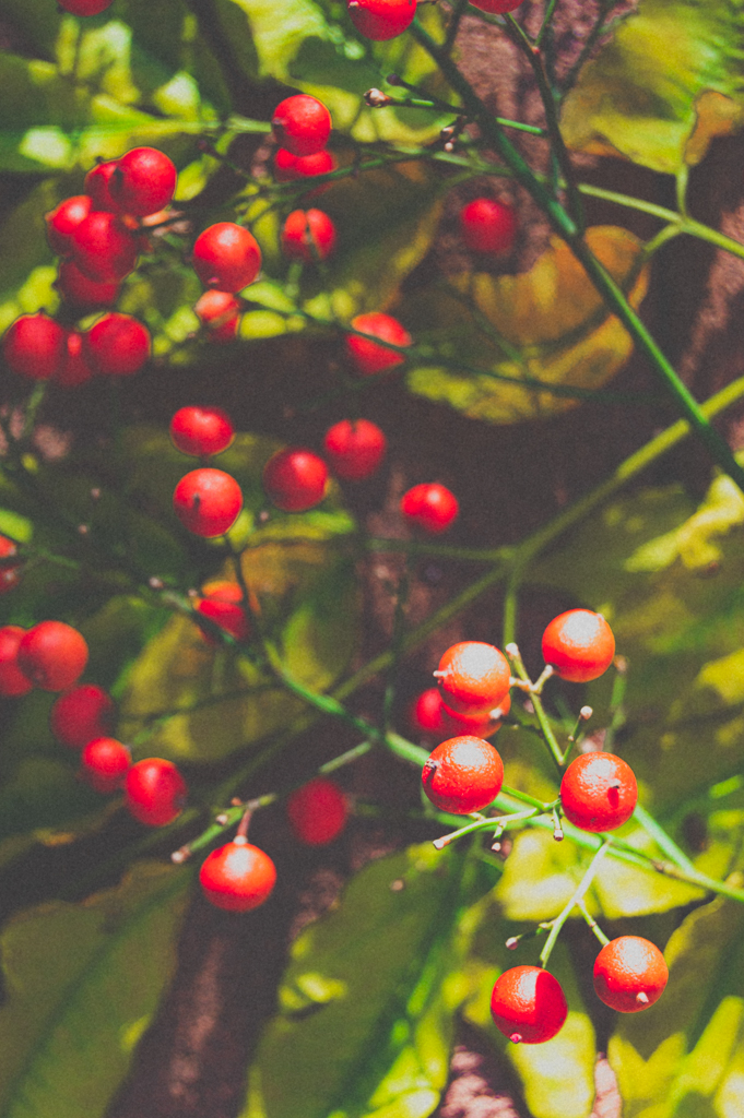
For our discussion there are a few important aspects of this image to note:
- The image is darkest in the background (top left) and transitions to being brighter in the foreground (bottom right)
- We primarily have the subject in red and the background element (leaves) in green
- The brightness of our red and green elements in their respective sections of the image are approximately the same
If we were to simply convert this image to a B&W one we get the following:
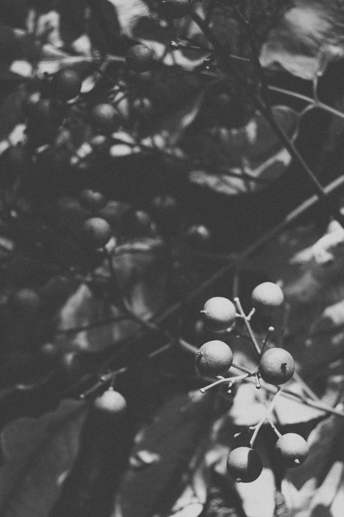
From the above we see that the distinction between our red and green elements isn’t really visible anymore, this is because of the impact that colour mixing has on our image. Mixing allows us to control the way the different colours are seen in the image and most photo editing tools have some version of a Black and White Mixer that allows us to apply a colour filter to a Black and White image
Neutral Filtering
This is the “natural” way that a B&W conversion works, using this method for any two colours at approximately the same brightness we should see the same brightness in the B&W version
If we look at the neutral version of our image we can observe that the brightness across our image is fairly consistent with that of the colour version with a darker background and brighter foreground. We can also see that there is very little differentiation between the red and green elements in our image

In photography, there are few well-known colour filters which can be placed in front of your lens to achieve what we are doing here digitally. Commonly we have red, green, blue, and yellow filters. We’ll just be looking at the red and green filters that were used to edit this image
Red Filter
In a picture like this where our subject is red, we can use a red filter to increase the brightness of the red portions of our image. To do this we would bump up the red and orange sections of our colours while trying to maintain a smooth change from one colour to the next to prevent any sharp changes in the brightness of our image
Additionally, I’ve also made the green slightly darker to add some additional contrast. We can see the result of doing so along with the changes made to the brightness of the respective colours below:

Using a method like this we can draw our focus back to the red elements a little more than if we had left the brightnesses as they were in the Neutral image while pushing down the brightness of our green elements so we don’t have the two competing for focus
Green Filter
We can also do something like the above using a filter that brightens the green and darkens the red

In the resulting image above we can see that the greens are now much brighter and the reds are almost black - however we still maintain a good level of contrast between our too resulting elements. We can see a comparison of the impact the different colour filters have on our image below. These are ordered from left to right as red, neutral and green
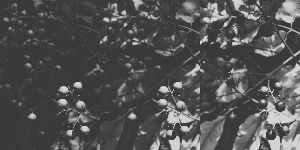
Using what we’ve looked at in the above we can see that the way we choose to filter a black and white image has a huge impact on how we direct the viewer’s attention in our image as well as how clearly we can differentiate between different elements
Note that while we do have different common colour filters, when editing a B&W image it usually makes sense to play around with your Black and White Mixer Tool to see what works best for your image
Nabeel Valley